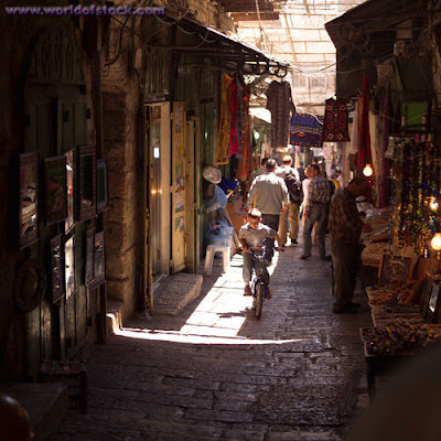
I loved the bright colours, and hanging drapes that would cast all sorts of shadows once comped with a sunset.
However, thought would be aesthetically pleasing, I feel someone being mugged in the fashion that she was would not be carried out in a busy market place, and so I changed my idea so it looked more like a side street. I therefore came up with the following.
This is a first render, and there are some focusing issues. I was trying to make it look like depth of field and the camera focusing on the fight at the end of the street. However it hasn't quite worked and looks a bit blurry. Also After Effects has dropped all the clipped layers I had in place and so there are some colour issues that need to be fixed.


No comments:
Post a Comment